Homepage
Before, the page described the business but gave less priority to the offer, benefits and main action. After the redesign, the first screen clarifies the location, offer type, advantages and CTAs.
Every project starts with a concrete problem: an offer that is not understood fast enough, proof that sits too low, a confusing path, or a page that does not give enough reasons to act.
Prefer email? contact@phuclabs.app
 AlloBoxCommercial redesign, local SEO and key pages.
 Fleurs de TaoPremium local offer clarified.
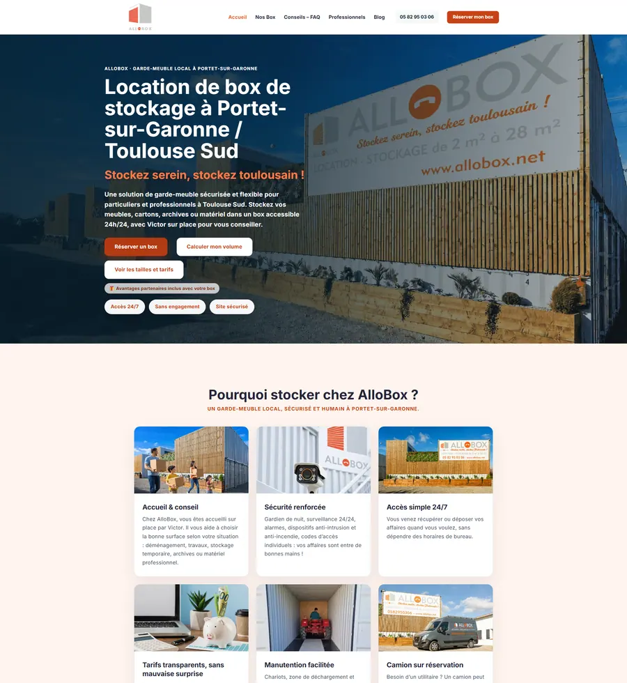
AlloBox is a self-storage center in Portet-sur-Garonne. The project focused on making the offer easier to understand, storage formats easier to compare, pricing more visible and the contact path more reassuring.
The positioning, box formats, pricing and contact path were not strongly prioritized. The older pages also gave less space to concrete advantages: 24/7 access, proximity to Toulouse South, support and partner discounts.
Homepage, Box Offers and Contact / quote / callback were rebuilt around clearer box sizes, visible pricing, cleaner CTAs, stronger reassurance, basic local SEO, more readable mobile journeys and a cleaner production release.
Before, the page described the business but gave less priority to the offer, benefits and main action. After the redesign, the first screen clarifies the location, offer type, advantages and CTAs.
Before, the formats existed but were less commercially structured. After the redesign, sizes, prices, benefits and CTAs sit inside a more direct decision path.
Before, the contact page mostly acted as a form. After the redesign, it becomes a conversion page with phone, callback, quote request, address, map, FAQ and reassurance.
The site now presents the AlloBox offer in a clearer, more structured and more reassuring way, with a journey designed to help visitors choose a format, understand pricing and contact the team.
This project makes concrete improvements visible: a clearer offer hierarchy, more readable key pages and simpler decision points for visitors looking for storage around Toulouse South.
The work focuses on offer clarity, message hierarchy, proof, calls to action, responsive behavior and the coherence of the journey. Design is used to make the offer easier to understand, reassure at the right moment and make action feel more natural.
Visitors need to understand what is offered, who it is for and why they should keep reading.
Trust signals should appear before the visitor reaches a point of hesitation.
The next step becomes easier to find, without adding unnecessary choices.
The copy guides, explains and reassures without turning the page into a dense pitch.
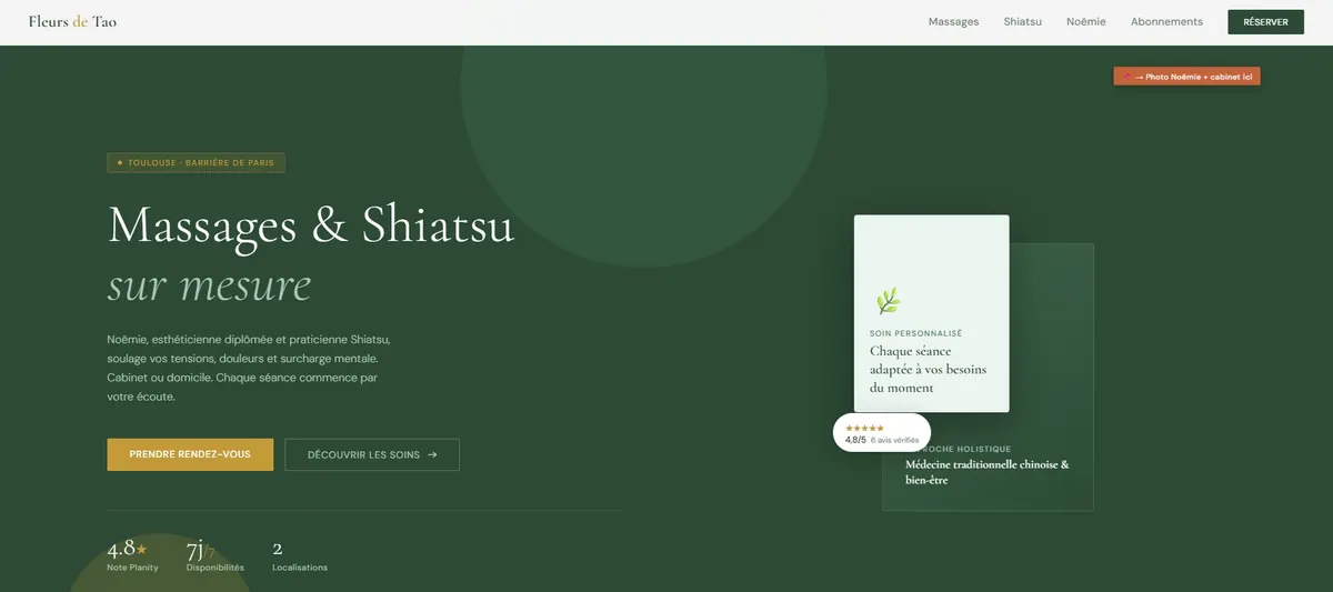
Noëmie, an independent shiatsu practitioner in Toulouse, needed a clearer online presence for a sensitive local offer: understand the treatments, feel reassured, compare formats and know how to book without friction.
The information was there, but visitors had to connect the treatments, benefits, pricing and booking path by themselves.
The redesign places the promise, services, proof and CTAs in a more natural progression.
The offer becomes easier to read, decision areas are better supported and the path to booking is more obvious.
The work covers page architecture, message hierarchy, CTAs, visuals, pricing and mobile adaptation.
Some missions are not public yet: landing page audits, SaaS redesigns, expert-led service pages or local websites with conversion stakes.
Pages designed to make complex value easier to understand, trust and act on.
Clearer presences for selling expertise without relying only on referrals.
Redesigns focused on clarity, reassurance, contact and booking.
I can identify what blocks action, then rebuild a clearer, more credible and more conversion-focused page.
Request a landing page audit